04 Aug

Nowadays people spend more time on their mobile phones. The way we use the web and, consequently, it has changed SEO. Mobile SEO helps you to reach customers and satisfy their needs while enjoying the experience.
Mobile SEO should always be a work in progress because there are always new developments, but also technologies arrive and are superseded. The world is always changing, and you need to keep up. If you do, the rewards can be great.
What is mobile SEO?
Mobile SEO offers an exceptional experience to visitors of your mobile site. It’s about making your mobile site load quickly and without issues, and presenting stellar content that matches the users search intent. In today’s mobile-first world, it’s incredibly important to have flawless mobile site.
Mobile optimization ensures that mobile visitors have an experience optimized for their mobile device and takes into consideration site design, site structure, page speed and more to ensure a quality mobile user experience. If your website is already well optimized for search engines, then making some additional changes is all you need to think about when optimizing for mobile.
Why is mobile SEO so important?
Mobile SEO helps you reach out to your customers in the right place at the right time and give them the very best experience. Mobile traffic has now eclipsed desktop traffic. Billions of people have discovered the enormous advantages of the smartphone. Our whole lives are in these devices – it’s almost scary to see how attached we’ve become to our smartphones. Many people call it an extension of themselves and something they can’t live without. To reach these people you need a mobile SEO strategy.
If you don’t have a mobile-friendly website, you risk people having a negative perception of your business and bouncing off your pages, which hurts your ranking. By having a mobile-friendly website, you’ll improve the opinion of more than 60% of users that find your business.
Your mobile-friendliness impacts your conversion rate. If your site works properly on smartphones, your audience is more likely to purchase products from your company. A mobile-friendly website will help you earn more conversions for your business.
Since more and more people use their phones to search the web, Google has shifted to a “mobile-first index.” What this means is Google’s crawlers will read your mobile site first. Having a site that isn’t mobile-friendly will hurt your position in the search results, leading to less traffic, fewer leads, and decreased revenue for your business.

How to check if you have a mobile-friendly website
Before you make drastic changes to improve your mobile SEO, check to see if your site is actually mobile-friendly. The best part is you don’t have to load every page on your mobile device to get a reading of your site’s mobile-friendliness. An easy way to test mobile-friendliness is to use Google’s mobile page testing tool.
You can either search for the mobile-friendly test on Google, or go directly to the website. All you have to do is enter the URL of the page you want to check and click “Test URL.” If you use Google Search Console, testing your entire site is even simpler with the Mobile Usability report. This will test the mobile-friendliness of your site and separate URLs into categories according to their issues. Once your mobile-friendly analysis is complete, you’ll have a better idea of the work you need to do for your mobile SEO strategy.
Mobile SEO vs. desktop SEO
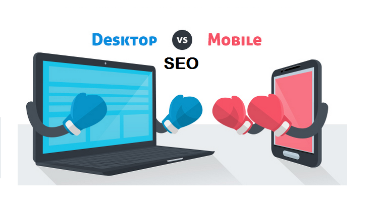
There’s quite a difference between desktop SEO and mobile SEO, but the goals are often comparable. You want to reach your audience and convert them into paying customers. In some ways, desktop SEO tactics also work for mobile SEO, but in a slightly different form. Three major themes still apply: focus on performance, user experience and content. In desktop SEO, you’ll often focus more on the general public, while mobile SEO can also have more of a local focus.
What is different, though, is the results you get on mobile versus desktop. For the same search query, different results may pop up depending on what device you are using. Plus, there are other factors that influence the mobile search results, like the location you’re at. This means that getting a good ranking for your product or content on desktop doesn’t guarantee the same result on mobile. When evaluating your performance on mobile, alway keep an eye on the mobile search results.
In addition, it is always a good idea to regularly check what Google is doing on mobile, in general, but especially in your niche. Google is continuing its push for so-called rich results often powered by structured data and these are more prominent on mobile. Think about it: searching for flights, events, jobs, movies, music, products and even simple facts will trigger a Google-owned rich result. We’re going to see a lot more of this going forward.
How to improve mobile SEO
Mobile SEO is just like regular SEO all about making sure your site is crawlable and findable. Also, you need stellar performance, great content and a flawless UX. To get it right, you need to know how your site is currently performing and what your visitors are doing right now. For example, will people use the same keywords on mobile to find you? People often change how they search while using a mobile device. And what do you want people to do? Offering to navigate to the nearest Whole Foods is less than ideal when you’re on a desktop machine. It makes total sense on your smartphone, though.
Mobile SEO tools
You need to become best friends with Google Search Console. Its search tools are legendary and a big help if you want to find out how your site is doing in the search results. For instance, by using the Search Analytics feature, you can see how mobile and desktop users use words to find what they need. Are you targeting the right words? Should you focus on something else?
Googlebot needs to be able to crawl your JavaScript, CSS and image files to index it properly. There is a handy tool for this inside Search Console: URL Inspection. This tool lets you see exactly how Googlebot sees and renders your content. When the screen doesn’t align and the tool lists errors, you’ve got work to do.
Another Google Search Console feature that makes your life easier is the Mobile Usability tool. This tool checks your site and presents an overview of posts and pages that don’t follow Google’s mobile-friendly rules. This is an excellent way to start improving your mobile SEO.
Other tools
Some other great tools to up your mobile SEO game are Google’s Mobile-Friendly Test, Rich Results Test, Lighthouse, Analytics, SEMrush, Ahrefs, Ryte, ScreamingFrog, and SimilarWeb.

Best practices for creating an effective mobile SEO strategy
Now that you know why mobile SEO is so important, it’s time to start adapting your plan for your mobile users. Let’s take a look at nine best practices for improving your mobile SEO strategy.
1. Improve your site’s load time
Your site’s load time is an integral part of the mobile experience. When users search for information on-the-go, they want to access it quickly. If your website doesn’t load fast enough for your audience, they will bounce from your page.
To keep leads on your mobile site, you must improve your site’s load time. Google PageSpeed Insights will provide you with information on your site’s load time. Through this tool, you can see where your site performs well and where it needs improvement. Google will provide you with ways to improve your site’s load time for mobile users.
If you don’t have experience with coding or don’t have time to adapt your site to make changes, you can invest in page speed services from a digital marketing company. Page speed services enable you to rely on experts to help improve your page’s load time, which gives you the freedom to focus on running your business.
2. Integrate responsive design
Responsive design is a crucial component of creating a mobile-friendly website. When you use responsive design, you ensure that your website adapts to any device a user uses. Whether it’s a smartphone or tablet, your audience will get the best mobile experience for their device.
Integrating responsive design makes it easy for your audience to browse your site. They can easily scroll through your page and view your site correctly. For example, imagine trying to access the desktop version of your site on a mobile device. Everything would be crowded and unreadable, causing your audience to continually zoom in and out to read the information on your website.
Without responsive design, you’ll drive more leads away from your business. If they can’t easily access and read your information, they aren’t likely to remain on your site.
3. Focus on the user experience
This next tip goes hand-in-hand with responsive design. If you want to be successful with mobile-friendly SEO, you must focus on the user experience. Responsive design is part of a positive user experience. When leads can access and browse your site easily on mobile devices, it provides a positive experience for them.
There’s more to your website than just integrating responsive design. While responsive design is an excellent stepping-stone to creating a better mobile experience, you need to add other elements to your plan to ensure it boasts a great experience for users.
‘Thumb-friendly’ design
When you’re designing your mobile site, you must make it easy for your audience to scroll through and click on elements on your page. To do so, you’ll want to create a “thumb-friendly” design, since users primarily browse with their thumbs on mobile devices.
Easy-to-find calls to action (CTAs)
Call to action (CTA) buttons help your audience take the next step towards conversion. When you create a mobile-friendly website, ensure that your CTAs stand out on the page and are easy to find. Your audience should see a CTA on your page immediately, whether it’s a phone number or phrasing that guides users to the next page. Your CTA should also be big enough for users to easily click.
Ensure font is legible on smaller devices
Since users browse your site on devices with smaller screens, you must make fonts readable on these devices. Whether you choose a bolder font or make the font size more prominent, you should adjust your font to be easily legible on a mobile device.
4. Be careful of pop-ups
Pop-ups are an effective way to draw your audience’s attention to a certain action. Whether it’s to sign up to receive emails or download free content, many companies use pop-ups to draw the user’s attention towards the action you want them to take.
Specific actions can trigger a pop-up to appear on the screen. It may be when someone first enters a page, when they scroll to a particular part of the page, or even when they move their mouse to head back to the search results. Pop-ups effectively help catch your audience’s attention and get them to look at the vital information you want to share.
However, these pop-ups can be an issue on mobile devices. If your pop-up takes up the entire screen on mobile, it will leave users frustrated. They won’t be able to see the information that they visited your site for, and they might not understand how to get rid of the popup. This could cause users to leave your site.
If you’re going to use pop-ups on your site, be careful of how you use them. You don’t want to use too many pop-ups on mobile devices because it can drive people away. Use them sparingly and on parts of your page where the pop-up matters most, and it won’t cover important information.
You should also make sure that your pop up displays an easy way to get rid of them, like a prominent “x” at the top. If you want to be effective with mobile SEO, exercise caution when using pop-ups on your page.

5. Optimize for local
An essential part of mobile SEO involves local SEO. Mobile searches using the phrase “near me” occurred three times more in the past few years, meaning that more and more users search for local businesses.
People often search with phrases like “near me,” “open now,” and “where can I buy” to find local businesses near them. With so many people searching using local phrases on mobile, you must adapt your strategy to reach these people.
You can adapt to local searches by using local keywords. A keyword like “flower shop in Harrisburg, PA,” is an excellent example of a local keyword. If someone searches for a local flower shop, they’re likely to search “flower shop in [city]” to find one.
Using local keywords will help you appear in more local search results. It’s a great strategy to help you excel with your mobile SEO strategy.
6. Implement a clean, easy-to-use navigation bar
Your navigation plays a vital role in how users find and access information. If your navigation is too challenging to use, users will get frustrated and leave your site. To ensure you’re creating a positive environment for your audience, create mobile-friendly navigation.
The best way to create mobile-friendly navigation is by using a hamburger menu. Hamburger menus appear at the top of a page with three lines. When users click on this button, they’ll see a drop-down menu with all the different pages they can visit.
A hamburger menu makes it easy for you to keep your navigation organized for your audience. It keeps your site clean and is easy for your audience to use to find information.
7. Optimize title tags and meta descriptions
An essential part of mobile SEO is your title tags and meta descriptions. These two elements determine whether someone clicks on your listing in the search results. Since mobile users look for information fast, they’ll often use your title tag and meta description to determine if they should click on your listing.
Title tags
Title tags are the first thing your audience sees in the search results. These tags tell your audience what your page covers. These title tags serve as a preview of your page. If you want to drive more relevant mobile traffic to your site, you must optimize your title tag.
A good title utilizes your keywords. Your keyword should appear at the front of the title tag, so your audience knows your listing is relevant to their search query. Your title tag should be descriptive and inform your audience about what they’ll find on your page.
Meta description
Your meta description is the short blurb your audience sees after your title tag. It provides your audience with additional information about your listing.
Your meta description provides your audience with a preview of your page. It helps them determine if your page is relevant to their search query. You’ll get more mobile users to click on your site if you have a short and descriptive meta description.

8. Create a separate mobile URL
When companies optimize for mobile, many will create a different mobile URL. With a separate mobile URL, you create a parallel site for mobile users. It allows you to create a custom experience for people who visit your website through mobile devices.
A mobile URL typically appears as “m.website.com” or “website.com/mobile.” When users enter your site through a mobile URL, they see a version of your site that’s adapted for mobile devices. This adaptation allows users to experience your site.
9. Create mobile content
A great mobile SEO tip is to create mobile content. When you create mobile content, you format it to provide a positive experience on mobile devices. If you want to create mobile-friendly content, you’ll want to make it easy for users to scroll through it. For example, keeping paragraphs at 2-3 sentences will make it easier for your audience to read or skim through your article.
You’ll want to add photos and videos to your content, too. It will keep your content interesting and offer engagement points for your audience. You’ll also want to add interactive elements, like clickable buttons, to make it easy for users to browse your mobile site.
Mobile SEO is designing for performance
The number one thing you should be focusing on when you’re trying to improve mobile SEO is performance. Performance almost entirely boils down to site speed. It’s a no-brainer: the faster your site is, the happier your users will be. It’s well known that a site has to load within a couple of seconds or your visitors will give up and go elsewhere. If you combine this with the fact that sites are only getting bigger, it’s clear you have your work cut out.
Optimizing performance, however, is a continuous process. Your site will never be fast enough because there’s always more you can improve – and that’s ok. By keeping a close watch on how your mobile site is performing, you can immediately jump onto every opportunity to improve it. Google loves fast sites, and so do your customers.
Responsive design vs. dynamic serving vs. separate domain
While developing your mobile site, you’ll have three options: responsive design, dynamic serving, or a separate site on a subdomain. Google prefers responsive design because you only have one site that adapts to the device it’s used on. There’s only one code base, so maintenance is easy. According to Google, using responsive design will make your site eligible for addition in the new mobile-first index. Always let Google know that your site is mobile-friendly by adding the meta name=“viewport” declaration in the head of your documents.
Dynamic serving
Dynamic serving takes a different approach. It uses server-side technology to serve a different version of your site to mobile users, depending on the way they access your site. The URL stays the same, but the files sent are completely different. You need to add the Vary header to get Google to crawl your site. This way, Google immediately knows that it will receive mobile-optimized files from somewhere else. A Vary header appears like this when a browser makes a request:
Vary: User-Agent
A separate domain
The third option is a separate mobile site on a different URL – usually an m. domain – and with different content. Google supports this method, but only if you make the correct connections between your regular desktop domain and the mobile domain. Use rel=”alternate” and rel=”canonical” to tell Google how these pages are connected. More on these different types and how Google uses them on this Developers page. Or you can read our rel=”canonical” ultimate guide.
Improve site speed of your mobile site
One of the most importants aspects of mobile SEO is improving site speed. PageSpeed Insights shows you exactly how fast your site loads on both mobile and desktop. It also suggests performance improving enhancements. Use this alongside the Developer Tools in browsers and the Core Web Vitals Report in Search Console to see how your site is rendering its contents.
Among other things, PageSpeed Insights looks at the three current Core Web Vitals metrics:
- CLP (largest contentful paint): The largest contentful paint happens when the largest element of a requested page appears on the screen. A good grade gives users the feeling that the site loads fast. A slow site can lead to frustration.
- FID (first input delay): The first input delay is the time between the first interaction of a user with an element on the requested page and the reaction of the browser to that input. How quickly your page reacts to input is of utmost importance for it to appear fast and responsive.
- CLS (cumulative layout shift): The cumulative layout shift measures the total time of movement on screen that happens during loading. This gives you an idea if stuff is jumping around which could make your site appear jerky.
Type in your URL and Insights will give you two scores: one for mobile and one for desktop. These will be different. If your score is red, you have much work to do. Orange means an average performance and green is good. It’ll give you suggestions on enhancing the performance of your site. Follow these suggestions, and you’ll be on the right track. What can you do to improve your site speed?
- Optimize images and use fewer images
- Invest in quality hosting
- Update PHP version to PHP7
- Keep your redirects in check
- Fix render-blocking content above the fold
- Prioritize visible content
- Optimize and minify CSS, HTML and JavaScript
- Cache your assets
- Use a CDN
- Make the transition to HTTP/2
- Upgrade to HTTPS
- Load fewer assets like JavaScript libraries
- Load fewer ad servers
- Improve server response time
Implementing AMP
The Google-led open source project AMP, or Accelerated Mobile Pages, has one goal: loading your pages as fast as possible. It’s been around for some time now. In the beginning, AMP was used on static posts, like blogs or news articles, that didn’t need interaction from the user. For e-commerce purposes and other dynamic types of pages, AMP fell short – until a year or so, that is. Today, AMP is capable of powering canonical sites, with more to come. Look into what AMP could do for your site and how you might implement it. Not every site needs it, but the ones that do could gain a lot from it.
Progressive Web Apps (PWA)
PWAs offers another way of targeting mobile users. A progressive web app (PWA) is an all-in-one solution that works on all devices, for all users. It’s the perfect crossover between the app world and the web world. The web app works like an app, without the need to publish it in an app store. PWAs combine the load speeds of mobile sites with the best functionality of a native app. When done correctly, a good PWA might fool users into thinking they are using a native app. Google has a must-read blog post if you want to know how to create indexable PWAs.
Thanks to technologies like service workers, the browser can do a lot more in the background, while keeping the front end updated in real-time. This makes it a good option if you need an app, but can’t justify the cost. There will be a lot happening with progressive web apps in the next couple of years. Every major browser — both mobile and desktop — now supports service workers, even Apple’s Safari on MacOS and iOS. There are, however, still some kinks to be ironed out before Apple’s implementation is solid.
Focus on user experience
Besides being easily found and lightning fast, your mobile site should offer an enjoyable user experience — especially now Google will factor it into their algorithm. Find out which common tasks your customers have on your site. What is their search intent? Try to remove any obstacles and make sure users can achieve their goals quickly. There’s a lot you need to consider when optimizing user experience. Here are a couple of things you need to think about:
- First and foremost: don’t forget your customer!
- Make your site mobile site useful and enjoyable
- Fix your font size: your typography needs to be top notch.
- Keep enough room between the clickable elements.
- Make your sub-menu clickable, so users don’t automatically go back to home instead of the submenu.
- Put your phone number on the homepage and make it clickable. This way, people can call you if they want to do business.
- Don’t make users pinch and zoom to see – and use – your interface.
- Make your buttons large enough for fingers.
- Fix your forms: bad forms are unusable on mobile.
- Cut the clutter.
- Test, adjust and test again!

Optimize for local
While we use our smartphones a lot in our homes, these devices become even more useful when we’re out and about. Google found that 76% of people who searched for something nearby visited a related business within a day. 28% of those visits led to a sale.
To cope with that local demand, or so-called near me searches, you need to work on your local SEO. Local search results can look very different from regular desktop searches, so you have to know what to target and how to target it. Here are some ways you can improve your local SEO for mobile:
- Write locally oriented content: It’s one of the best things you can do to improve local rankings.
- Build local links: Ask, and ye shall receive.
- Google My Business: Sign up and fill in your details. Here, you can keep your NAP data up to date, respond to reviews and upload photos, among other things.
- Reviews: Ask your customers for reviews, mark them up with structured data and present them on a particular page on your site. This does wonders.
- Photos: Take beautiful pictures of your business and add them to Google My Business.
- Schema.org: Add structured data for NAP details, products, reviews, etc. and you get mobile rich search results like rich cards or carousels.
- Contact details: Make sure your contact information is always correct and up to date. If not, fix it.
- Yoast Local SEO for WordPress plugin: This plugin can do a lot of the hard local SEO work for you.
Conclusion
Mobile SEO is an integral part of growing your business online. If you want to help your business grow through SEO, you must account for users that search for your business through mobile devices. A robust mobile SEO plan will help you reach leads interested in your business.